> ## Documentation Index
> Fetch the complete documentation index at: https://docs.weeziq.com/docs/llms.txt
> Use this file to discover all available pages before exploring further.
# Customization
> Full control over the appearance and behavior of your chatbot widget. Customize colors, themes, messages, rate limits, and more.
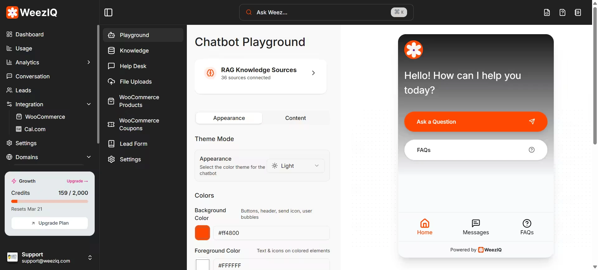 WeezIQ gives you granular control over the appearance and behavior of your chatbot widget. Every setting is configured per domain, so if you run multiple websites, each one can have a completely different look and feel.
## Branding and Appearance
### Display Identity
Give your chatbot a name and a face.
* **Display Name:** The name shown at the top of the chat widget (defaults to "WeezIQ AI"). You might change this to something like "Support Assistant" or your company's name.
* **Display Picture:** Upload your logo or a custom avatar. This appears in the chat header and alongside bot messages.
### Color Scheme
You can set individual colors for every visual element of the widget. Each accepts a hex color code so you can match your brand guidelines exactly.
| Setting | What It Controls | Default |
| --------------------- | -------------------------------------------- | --------- |
| **Primary Color** | Main accent color for buttons and highlights | `#ff4800` |
| **Secondary Color** | Supporting accent color | `#EE82EE` |
| **Button Color** | Color of send and action buttons | `#ff4800` |
| **Button Text Color** | Text color inside buttons | `#000000` |
| **Background Color** | The main chat window background | `#F9FAFB` |
| **Text Color** | The primary text color throughout the widget | `#111827` |
| **Header Color** | Background color of the chat header | `#F9FAFB` |
| **Card Color** | Background of cards (product cards, forms) | `#FFFFFF` |
| **Input Color** | Background of the message input field | `#FFFFFF` |
| **Border Color** | Dividers and outlines | `#E5E7EB` |
| **Foreground Color** | Foreground elements and icons | `#FFFFFF` |
### Theme Mode
Choose between **Light** and **Dark** themes. The widget will adapt its entire appearance based on this setting.
### Homepage Background
The chatbot's home screen can be customized with:
* **Background Type:** Solid color or a custom background image.
* **Background Color:** The solid color for the home screen.
* **Background Image:** Upload a custom image for the home screen backdrop.
* **Homepage Text Color:** Control the text color on the home screen.
## Conversational Behavior
The first message the chatbot sends when a user opens the widget. Make it warm and inviting.
*Example: "Hi there! I'm here to help. What can I do for you today?"*
Pre-written clickable prompts displayed above the text input. These give users a quick-start option without typing.
*Examples: "Where is my order?", "What are your return policies?", "Show me your pricing."*
You can control whether suggested messages appear only at the start of the conversation or after every response.
The placeholder text inside the input field (defaults to *"Type your message here..."*). Customize it to set the tone.
An optional banner notice that appears at the top of the chat interface. Useful for announcements like *"We're currently experiencing higher than usual volume."* Users can dismiss it.
A configurable summary that describes what your chatbot specializes in. This helps set expectations for the user.
## Rate Limiting
To prevent abuse and manage AI credit consumption, make sure to configure rate limits for production chatbots.
| Setting | Description | Default |
| ---------------------- | ------------------------------------------------ | ----------------------------------------------------------------- |
| **Enable/Disable** | Toggle rate limiting on or off | Off |
| **Message Count** | Maximum messages a user can send within a window | 20 |
| **Time Window** | Time period in minutes | 4 minutes |
| **Rate Limit Message** | Shown when a user exceeds the limit | *"Too many messages in a row. Please try again after some time."* |
## Credit Exhaustion Message
When your account runs out of AI credits, the chatbot needs to gracefully inform the user. You can set a custom message for this scenario.
Default message: *"I'm currently unavailable. Please try again later or contact support."*
## Help Desk Toggle
You can enable or disable the Help Desk feature for each domain. When enabled, users see an option to browse predefined Q\&A topics alongside the regular chat interface.
WeezIQ gives you granular control over the appearance and behavior of your chatbot widget. Every setting is configured per domain, so if you run multiple websites, each one can have a completely different look and feel.
## Branding and Appearance
### Display Identity
Give your chatbot a name and a face.
* **Display Name:** The name shown at the top of the chat widget (defaults to "WeezIQ AI"). You might change this to something like "Support Assistant" or your company's name.
* **Display Picture:** Upload your logo or a custom avatar. This appears in the chat header and alongside bot messages.
### Color Scheme
You can set individual colors for every visual element of the widget. Each accepts a hex color code so you can match your brand guidelines exactly.
| Setting | What It Controls | Default |
| --------------------- | -------------------------------------------- | --------- |
| **Primary Color** | Main accent color for buttons and highlights | `#ff4800` |
| **Secondary Color** | Supporting accent color | `#EE82EE` |
| **Button Color** | Color of send and action buttons | `#ff4800` |
| **Button Text Color** | Text color inside buttons | `#000000` |
| **Background Color** | The main chat window background | `#F9FAFB` |
| **Text Color** | The primary text color throughout the widget | `#111827` |
| **Header Color** | Background color of the chat header | `#F9FAFB` |
| **Card Color** | Background of cards (product cards, forms) | `#FFFFFF` |
| **Input Color** | Background of the message input field | `#FFFFFF` |
| **Border Color** | Dividers and outlines | `#E5E7EB` |
| **Foreground Color** | Foreground elements and icons | `#FFFFFF` |
### Theme Mode
Choose between **Light** and **Dark** themes. The widget will adapt its entire appearance based on this setting.
### Homepage Background
The chatbot's home screen can be customized with:
* **Background Type:** Solid color or a custom background image.
* **Background Color:** The solid color for the home screen.
* **Background Image:** Upload a custom image for the home screen backdrop.
* **Homepage Text Color:** Control the text color on the home screen.
## Conversational Behavior
The first message the chatbot sends when a user opens the widget. Make it warm and inviting.
*Example: "Hi there! I'm here to help. What can I do for you today?"*
Pre-written clickable prompts displayed above the text input. These give users a quick-start option without typing.
*Examples: "Where is my order?", "What are your return policies?", "Show me your pricing."*
You can control whether suggested messages appear only at the start of the conversation or after every response.
The placeholder text inside the input field (defaults to *"Type your message here..."*). Customize it to set the tone.
An optional banner notice that appears at the top of the chat interface. Useful for announcements like *"We're currently experiencing higher than usual volume."* Users can dismiss it.
A configurable summary that describes what your chatbot specializes in. This helps set expectations for the user.
## Rate Limiting
To prevent abuse and manage AI credit consumption, make sure to configure rate limits for production chatbots.
| Setting | Description | Default |
| ---------------------- | ------------------------------------------------ | ----------------------------------------------------------------- |
| **Enable/Disable** | Toggle rate limiting on or off | Off |
| **Message Count** | Maximum messages a user can send within a window | 20 |
| **Time Window** | Time period in minutes | 4 minutes |
| **Rate Limit Message** | Shown when a user exceeds the limit | *"Too many messages in a row. Please try again after some time."* |
## Credit Exhaustion Message
When your account runs out of AI credits, the chatbot needs to gracefully inform the user. You can set a custom message for this scenario.
Default message: *"I'm currently unavailable. Please try again later or contact support."*
## Help Desk Toggle
You can enable or disable the Help Desk feature for each domain. When enabled, users see an option to browse predefined Q\&A topics alongside the regular chat interface.